Radical Nun Art
The largest copyrighted piece of artwork in the world and one of Boston’s most controversial pop art pieces does not hang in a gallery; it is painted boldly on a 140 ft gas tank off Interstate 93. The stark white tank is adorned with six oversized rainbow brush strokes. This famed landmark was commissioned in 1971 during the Vietnam War and immediately sparked tension for the supposed profile of Vietnamese communist leader Ho Chin Minh in the blue swash.
The radical artist behind the speculated war protest? Catholic nun and acclaimed artist Corita Kent. Kent denied that the silhouette was intentionally politically charged, however her tone of activism could not be forgotten. Rather than a radical beacon, Kent stated the tank was “a sign of hope that urges you to go on.” Kent joined the ranks of Andy Warhol and became regarded as one of the best pop artists of her time.
Corita Kent’s work is now on exhibit at the Harvard Art Museums until January 3, 2016. Harvard Art Museums' current Kent exhibit “The Language of Pop” displays more than 60 of her screen prints made between 1964 and 1969. In addition to her screenprints, the original 7 inch tall wooden tank model Kent used to practice the "rainbow swash" will make its public debut. Her work hangs alongside her contemporaries and as the Harvard Art Museums states, "'The Language of Pop' positions Kent and her work within the pop-art idiom." Kent is commonly excluded from the academic realms of this art genre even though this exhibit challenges these notions. The juxtaposition of her work with that of her peers reflects their parallels.
In addition to her art, the exhibit displays early films, books, and slides of Kent working and teaching at Immaculate Heart. The exhibition catalogue, published by the Harvard Art Museums and distributed by the Yale University Press, offers roughly 90 illustrated entries and four scholarly essays. Curator Susan Dackerman says, “I hope that viewers will realize that Kent's work is just as significant an artistic statement of the 1960s as was the work of her contemporaries.”
Corita Kent was born by the name of Frances Kent in 1918 in Fort Doge, Iowa. In 1936 she left her family and moved to Los Angeles to join the Order of the Immaculate Heart of Mary. It was there she took the name of Sister Mary Corita. Joining the convent enabled Kent to afford and obtain an education and to pursue her love for art. During the 1930‘s it was rare for a woman to pursue higher education let alone a career as an artist. Kent continued to pursue her dreams and ten years after graduating from the Immaculate Heart College she received her master’s degree in art history from the University of Southern California. Kent spent the following years passionately teaching art at Immaculate Heart College.
Sasha Carrera, Director of The Corita Art Center said, “what she taught was what she did was what she was thinking was what she was surrounded by.” Her zealousness lead her to be named the chairman of the school’s art department in 1964.
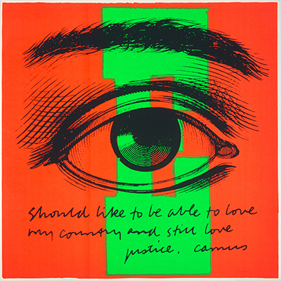
Kent experimented with printmaking while paying homage to her faith. In her early years she used the silkscreen printing process and her initial works were iconographic, using text and images from the Bible. She began to solidify her artistic style of silk-screen printing in the 1960s by referencing pop culture through juxtaposing the use of lyrics with advertisements, and vibrant colors.
The first signs of her work referencing social concerns through symbolism began with her featuring the aspirations of the Vatican II. The Catholic church was modernizing itself to shift with the times and the Vatican was looking for ways to connect with a younger following. Their mission was to campaign on the grounds of peace, social justice and civil rights. Kent eagerly aided to the movement by addressing issues of hunger and poverty.
Kent's work also enabled God or Christ to be more relatable to a modern audience. Her pieces also frequently displayed the Wonder Bread logo as a reference to the body of Christ.
Kent’s inspirational tone was drawn on by her faith. And although Kent was an acclaimed artist, she was also a nun. Dorris Donnelly, former teacher of the religious education department at Immaculate Heart College once pointed out just how different Kent was for her time,"This is the early '60s. In general, nuns wouldn't know the Beatles, she knew the Beatles. She understood the lyrics of the Beatles." Ian Berry co-curator of the Andy Warhol Museum says, "An 'artist' was from New York. They were a man; they were an epic, abstract painter. And she wore a habit — she just didn't look like what the, sort of, movie version of an artist looked like."
Kent said to the National Catholic Reporter in 1965, "The idea is to beat the system of advertising at its own game...To oppose crass realism, crass materialism, with religious values, or at least with real values."
As the Vietnam war intensified Kent’s focus began to shift from promoting reform in the Catholic church to communicating peace across all platforms. The cries of the 1960s heavily influenced Kent’s focus. Although her statements of solace were subtle and by no means radical, they were not always received warmly. During the end of the decade Kent was commissioned to decorate a Christmas window display for IBM for it’s Madison Avenue showroom. Kent’s piece contained 725 cardboard cereal boxes exhibiting quotations, silkscreens and photographs referencing the theme of “Peace on Earth”. People however felt it was a direct anti-war campaign and Kent was forced to revise her design. In Kent’s words, “ I am not brave enough to not pay my income tax and risk going to jail. But I can say rather freely what I want to say with my art.”
Sasha Carrera, Director of the Corita Art Center once said, “There was no separating ‘this is my political thought and this my artistic expression’ it was one and the same thing for Corita.” Like her contemporaries Kent’s art conveys a message. However, unlike them her art engages her audience to think, not simply to react. This can be seen in her early piece, “In that they may have life” where she uses a Wonder Bread wrapper displaying quotes of Mohandas Gandhi to prompt a meditation on hunger and poverty.

Harvard Art Museums curator Susan Dackerman states, “Kent's work is just as good as that of her contemporaries.” Kent’s work is undeniably comparable to the likes of Warhol, Ruscha and Roy Lichtenstein. Dackerman says, “It uses many of the same strategies, in terms of technique, palette, and insertion of text into the pictorial space. Yet because of its uplifting messages, it has been regarded as less serious as ‘art’ which it's not.”
Kent was a paradox. In many ways her divergence aided in her fame, but arguably it also hurt her credibility as an artist. Dackerman explains, “Because of Kent’s status as a nun, her biography has been the focus of most scholarship about her work.”
In 1968 Kent separated herself from the convent. With aims to devote her entire life to art she left the Order in Los Angeles and moved to Boston’s Back Bay. Kent’s presence in Boston added to the liberal fabric of the city. Over the next 18 years she created more than 400 serigraph works. She also remained an integral figure in social reform, creating posters and billboards for Share, the International Walk for Hunger, Physicians for Social Responsibility and Amnesty International. In 1985 Kent created her most well known work, the design for the “Love Stamp.” In similar form to the “Rainbow Swash” the stamp was adorned with bright swipes of color to symbolize hope, optimism and peace. After gaining national recognition for her efforts and talents Corita Kent passed away in 1986 from a six-month battle with cancer.
"The Language of Pop" places Kent at the center of the pop art conversation. She was deserving of such recognition during her lifetime and this exhibit begins to spark her deserving spotlight. In an interview with the Harvard Gazette, Dackerman stated, "What we wanted to do was actually look closely at her work, and look at it in a broader cultural, art-historical context--put it into the art-historical discourse."